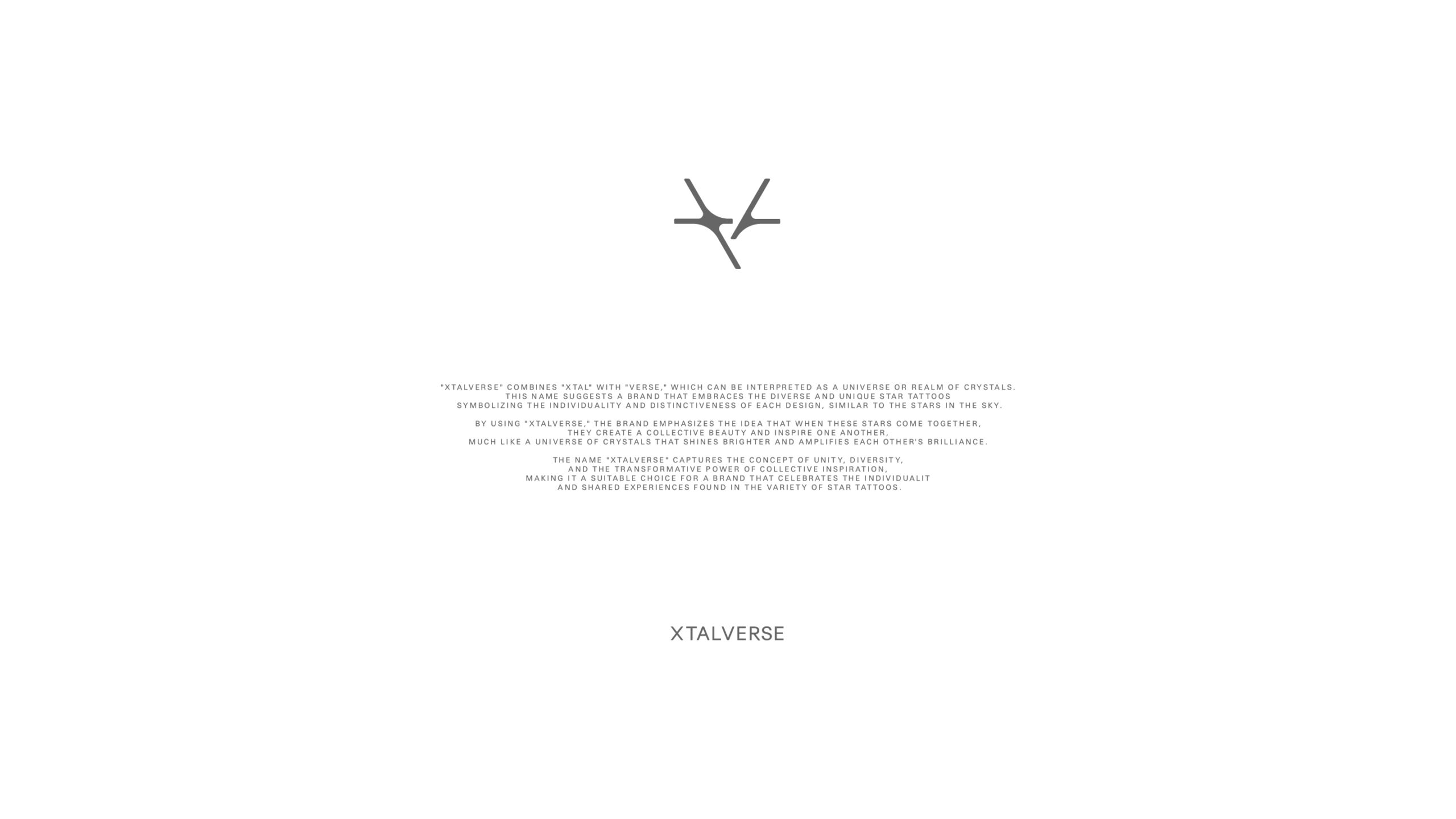
Xtalverse는 홍콩을 기반으로 전개되는 패션 브랜드로, 서로 다른 빛을 지닌 개별 존재들이 연대하며 만들어 내는 새로운 시너지에 주목한다. 각기 다른 별들이 모여 하나의 별자리를 이루듯, 독립적인 개인들이 연결될 때 발생하는 의미의 확장을 브랜드의 핵심 메시지로 삼는다.
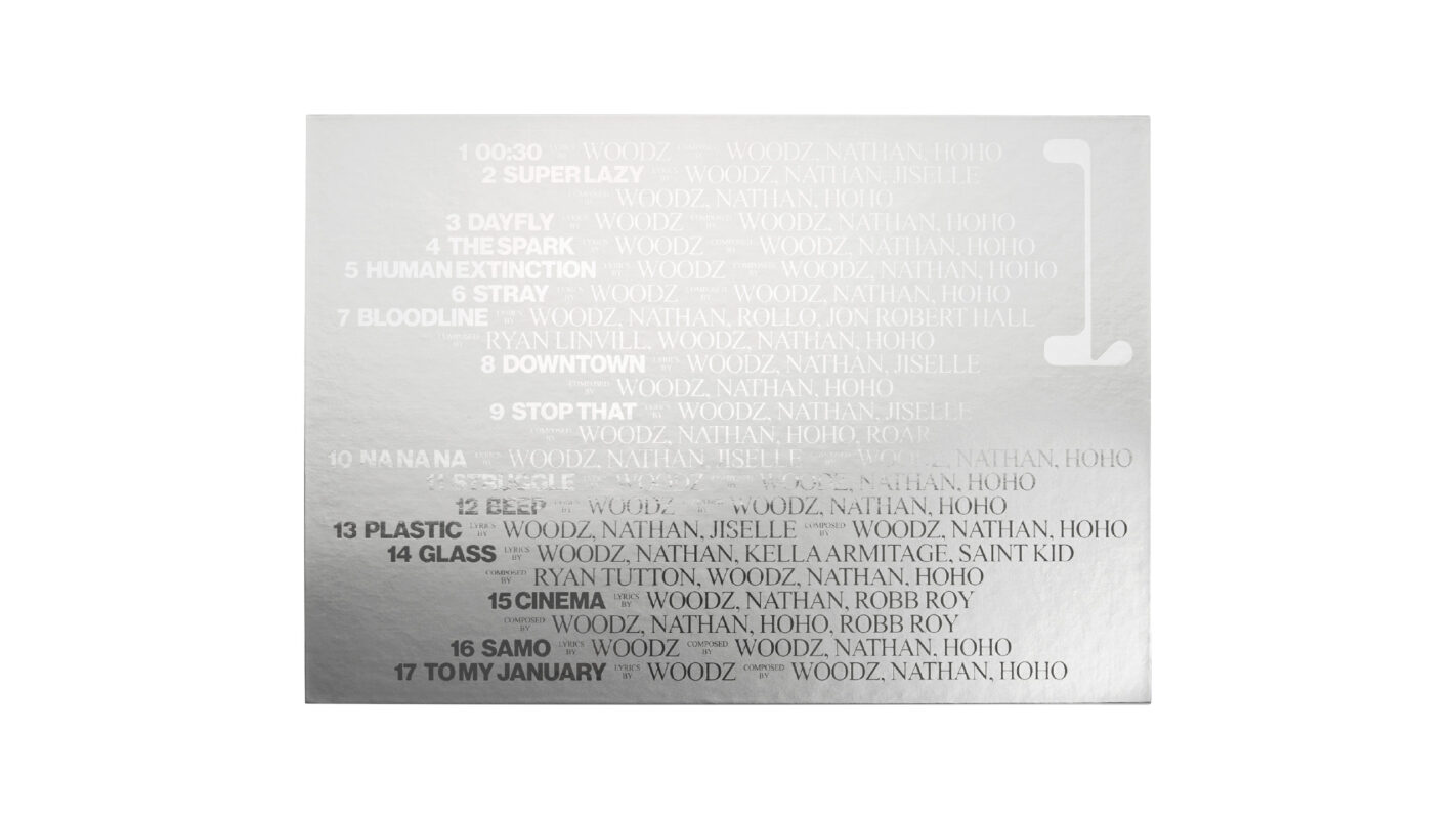
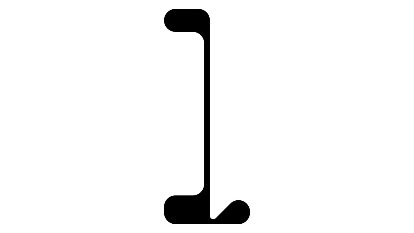
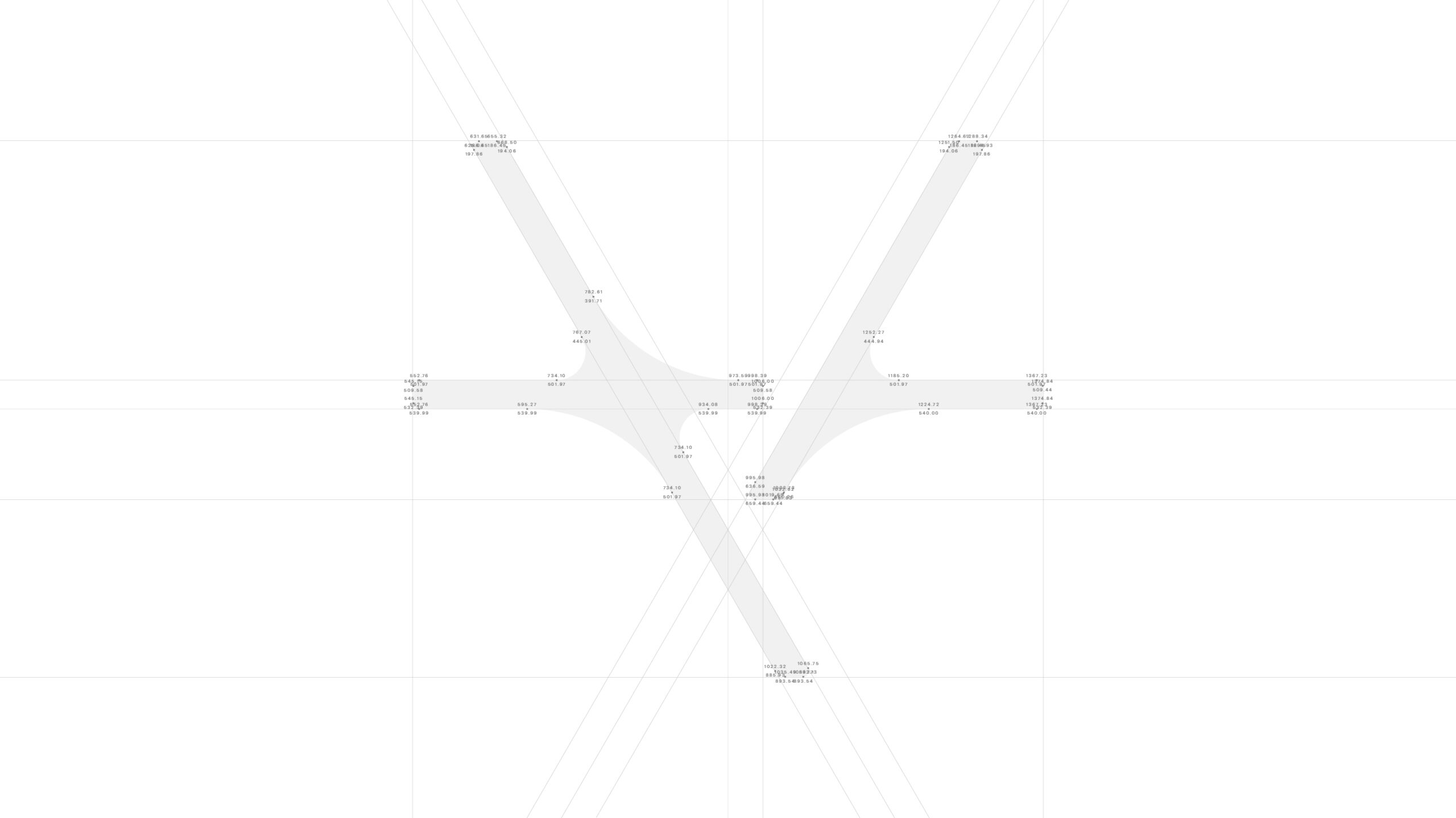
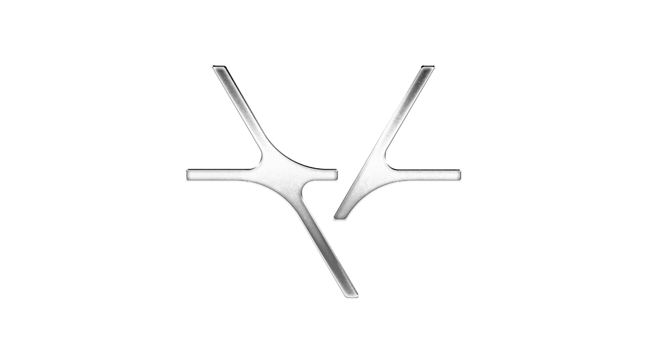
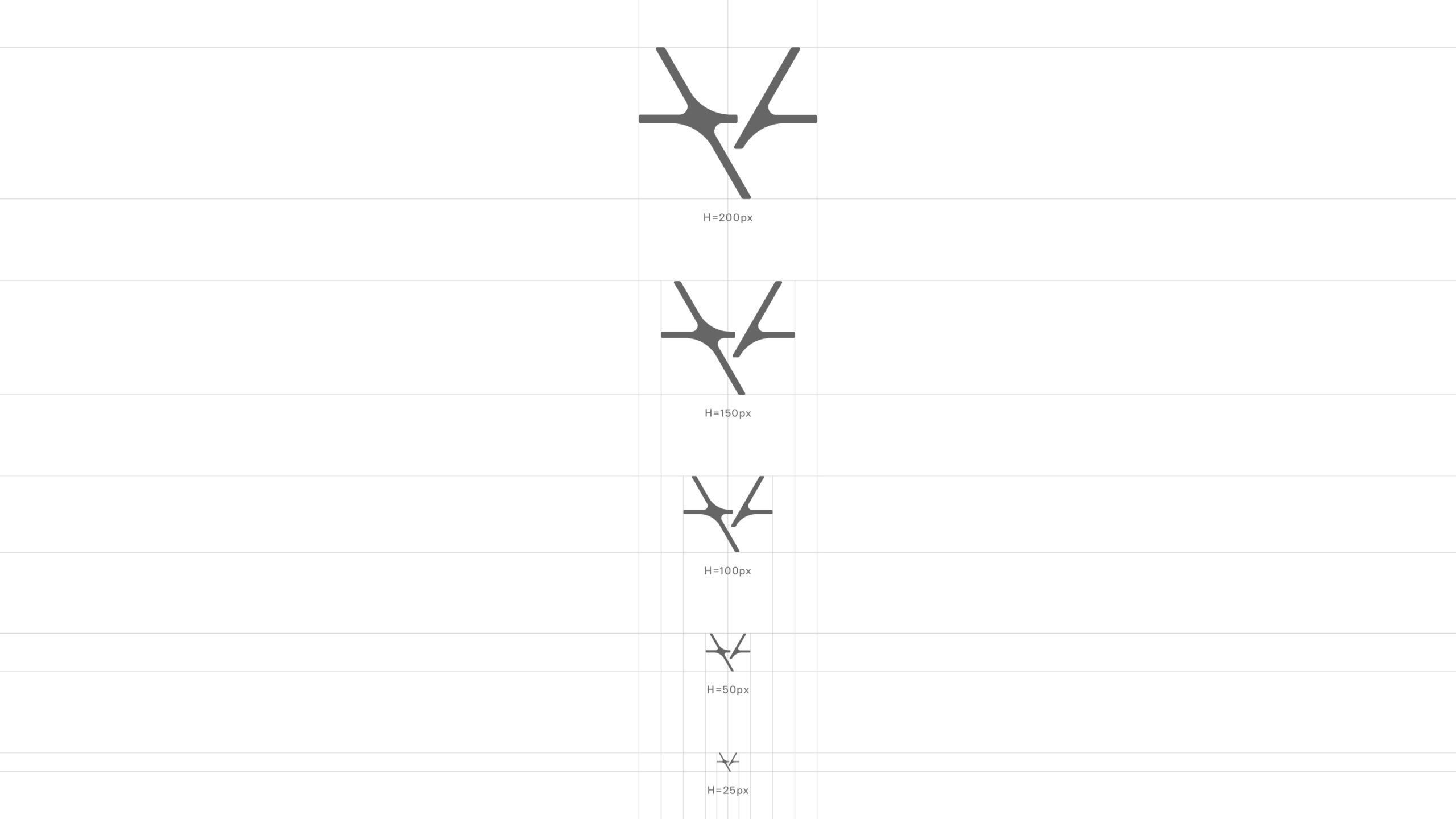
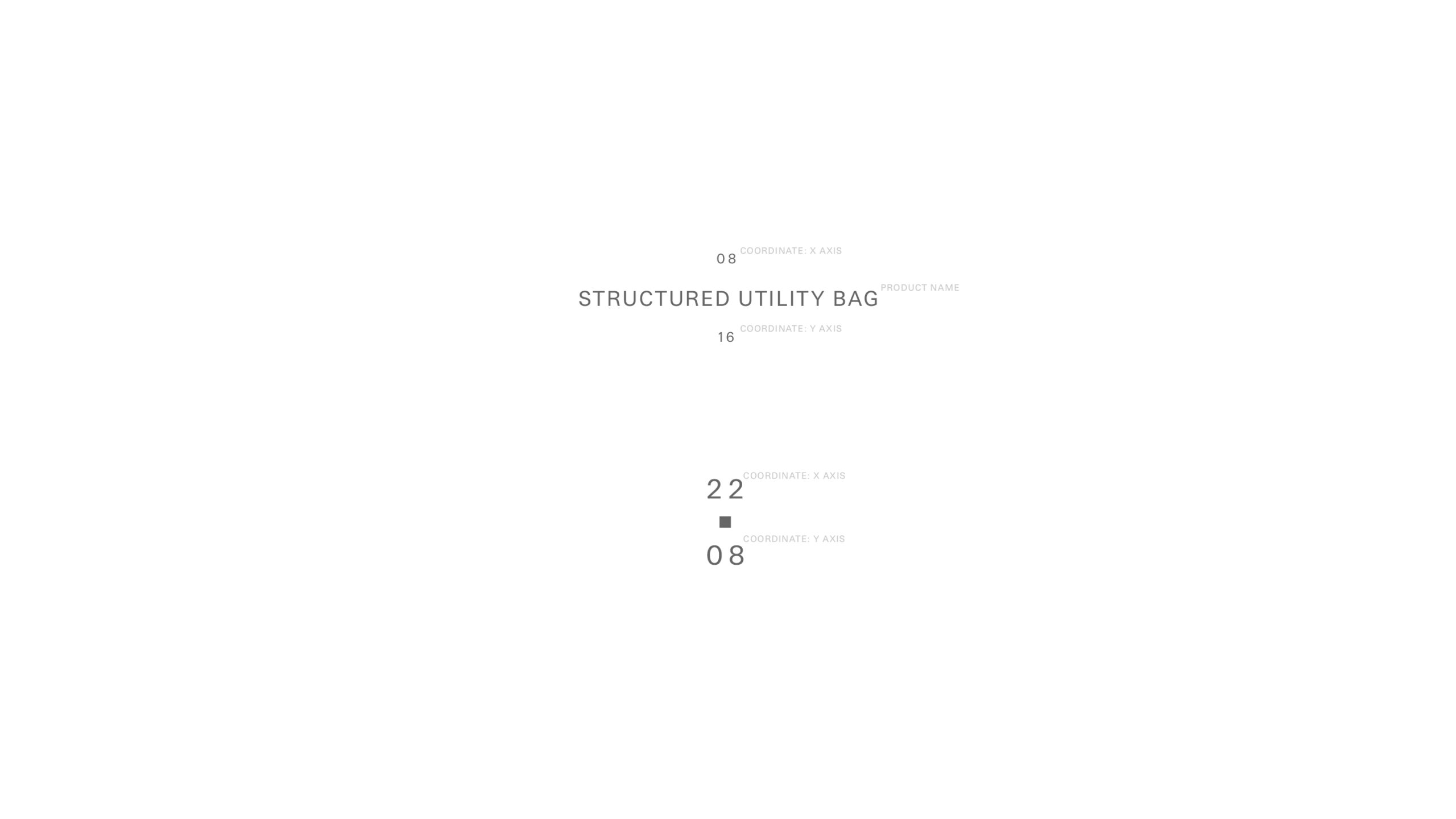
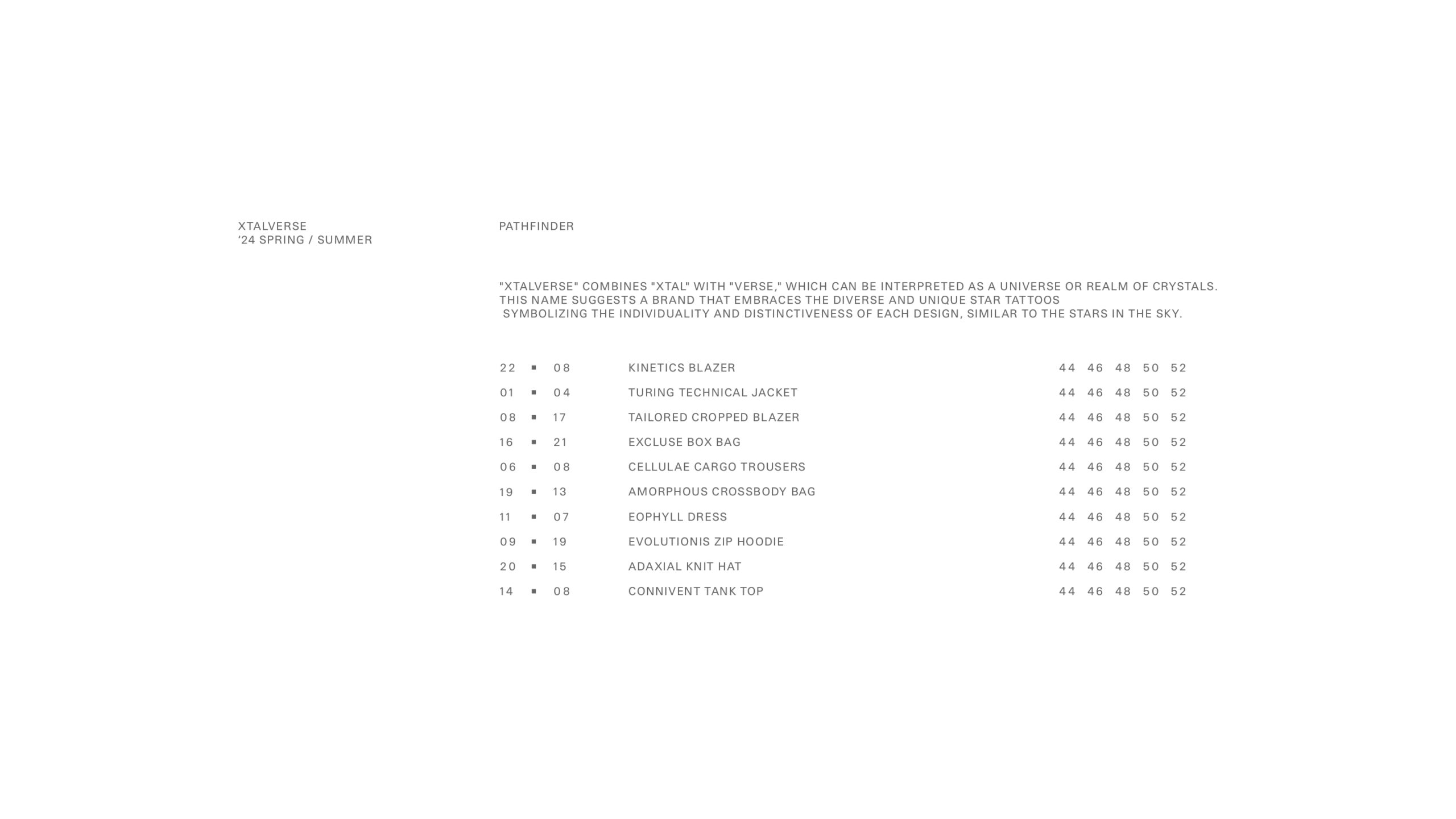
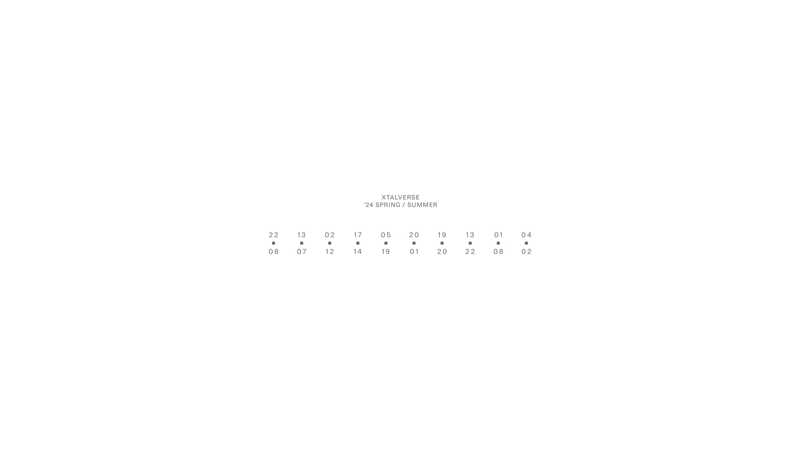
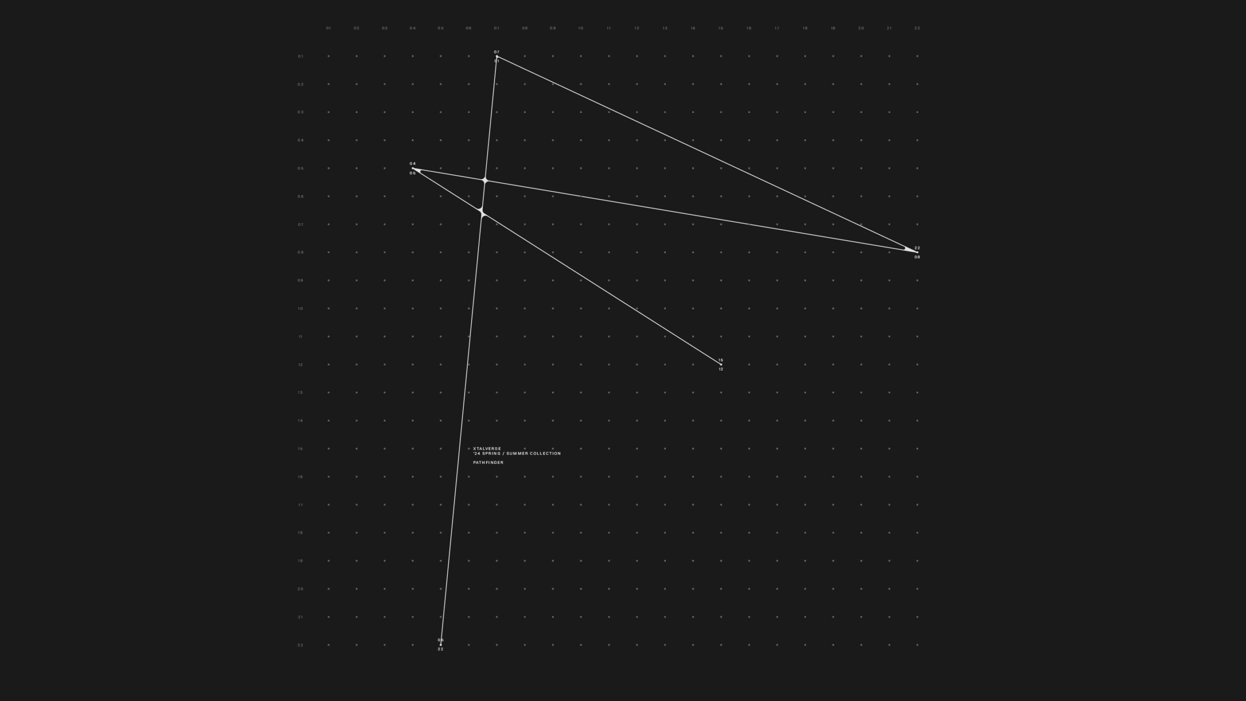
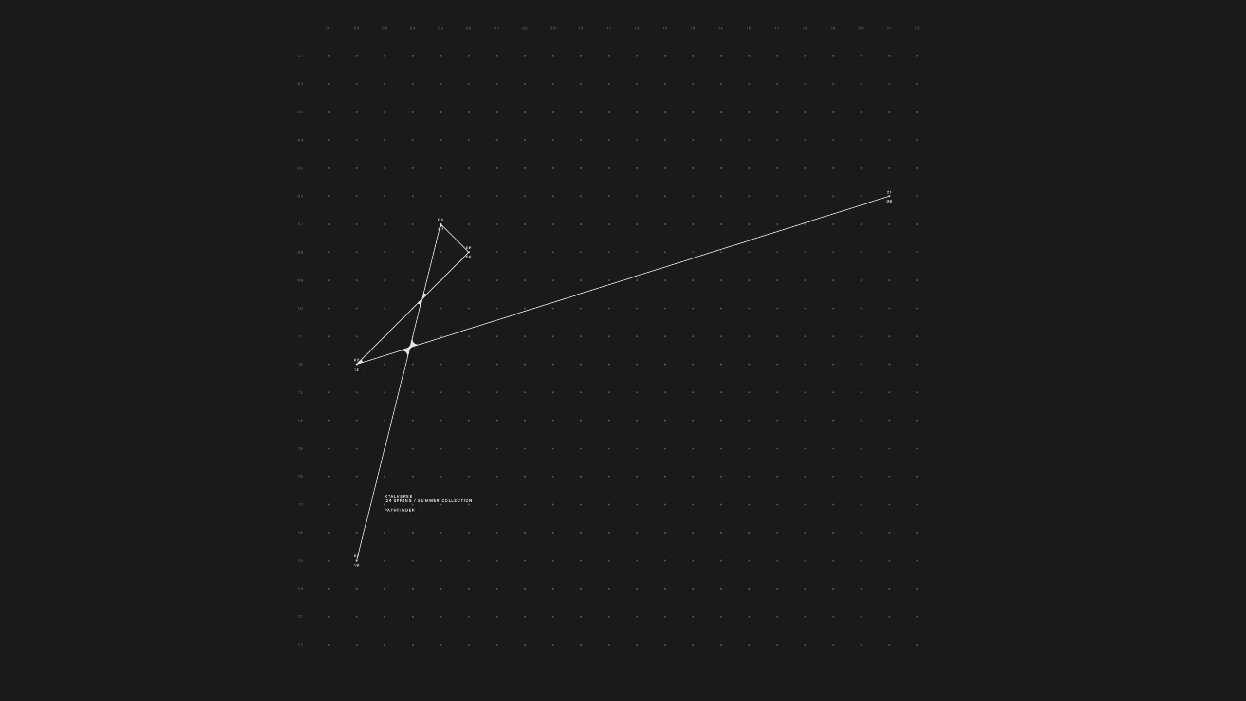
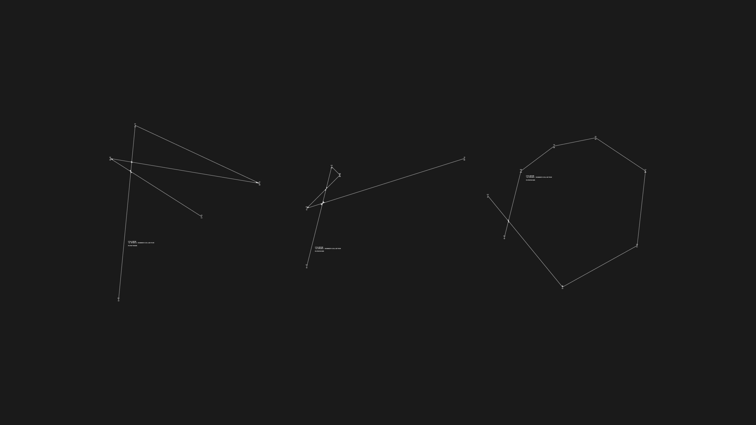
심볼 디자인은 이러한 개념을 시각적으로 풀어내기 위해 좌표평면 위에 흩어진 별빛을 연결하는 구조로 설계되었다. 점과 선의 조합을 통해 형성된 형태는 별자리를 연상시키며, 개별성과 연결성 사이의 긴장을 균형감 있게 드러낸다. 이는 단일한 상징보다 관계와 구조에 주목하는 브랜드 태도를 반영한다.
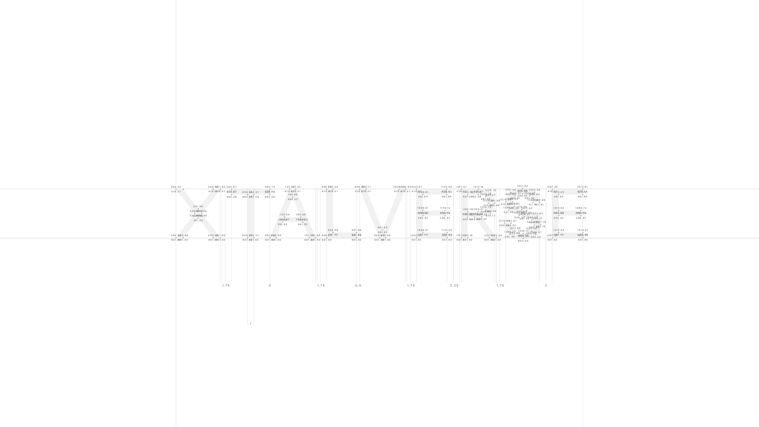
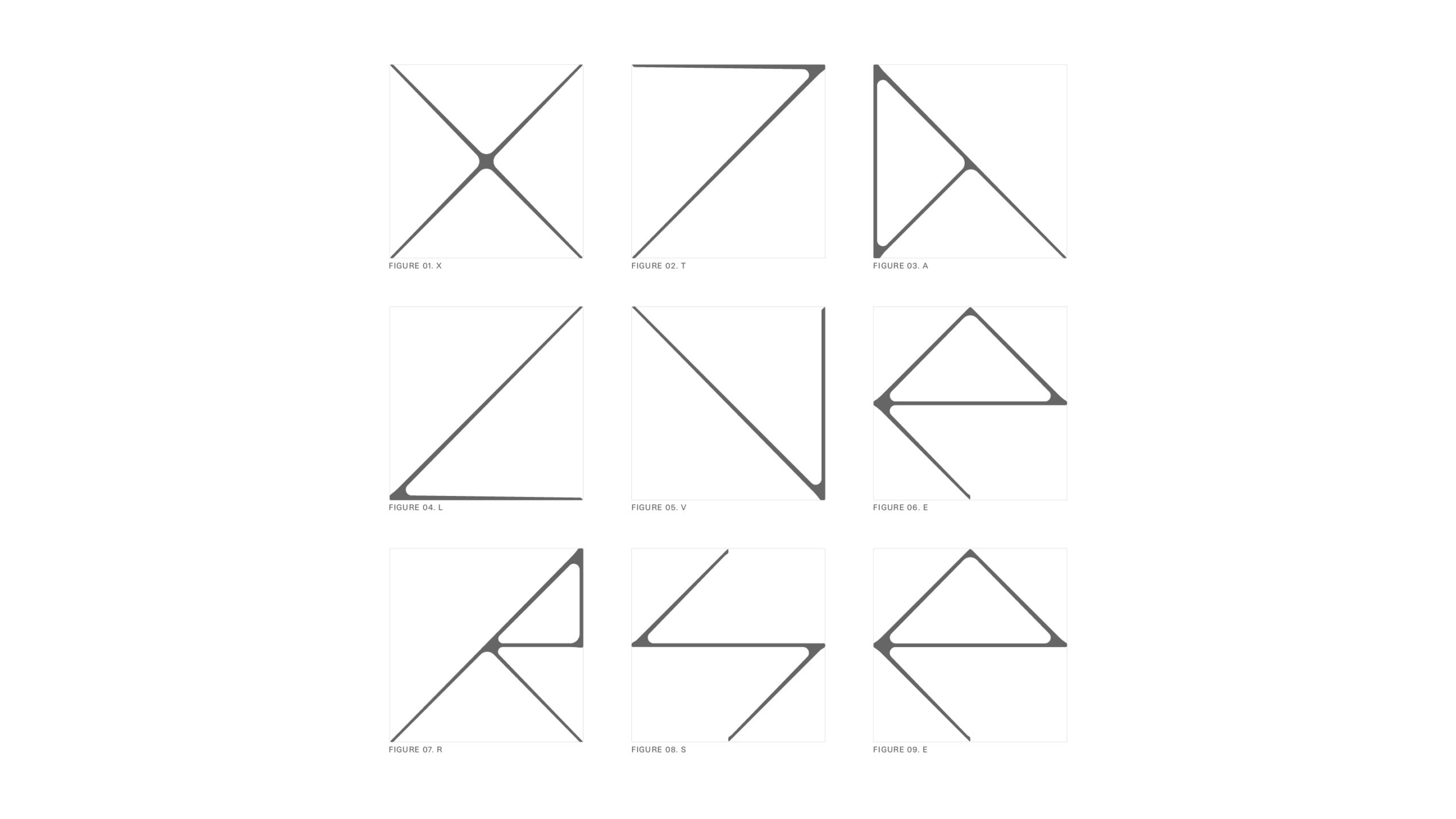
그래픽 시스템 전반에 활용된 타입페이스 역시 별빛에서 착안해 개발되었다. 빛의 분절, 연결, 흐름이라는 키워드를 기반으로 한 서체 디자인은 심볼과 유기적으로 호응하며, 브랜드가 지향하는 연대와 확장의 이미지를 시각 언어 전반으로 확장한다.
Xtalverse is a Hong Kong–based fashion brand that focuses on the new synergies created through the solidarity of individuals, each radiating a distinct light. Just as independent stars come together to form a constellation with new meaning, the brand conveys an expanded sense of identity born from connection and coexistence.
The symbol design visually interprets this concept through a structure of scattered points connected across a coordinate plane. Composed of dots and lines, the form evokes a constellation, balancing individuality and connectivity while emphasizing relationships and structure over a singular, fixed symbol.
The typeface used throughout the graphic system is also developed with starlight as its core motif. Inspired by the fragmentation, connection, and flow of light, the type design resonates organically with the symbol and extends the brand’s narrative of solidarity and expansion across its visual language.
Lee Raedong
Noh Hyerim
Lee Raedong
Jo Sangmin