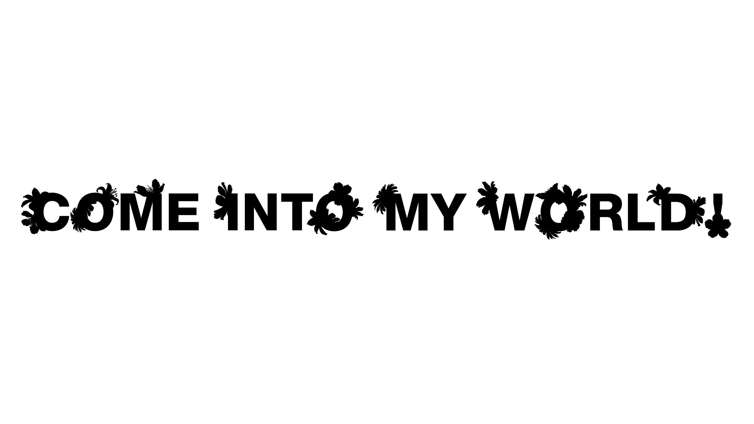
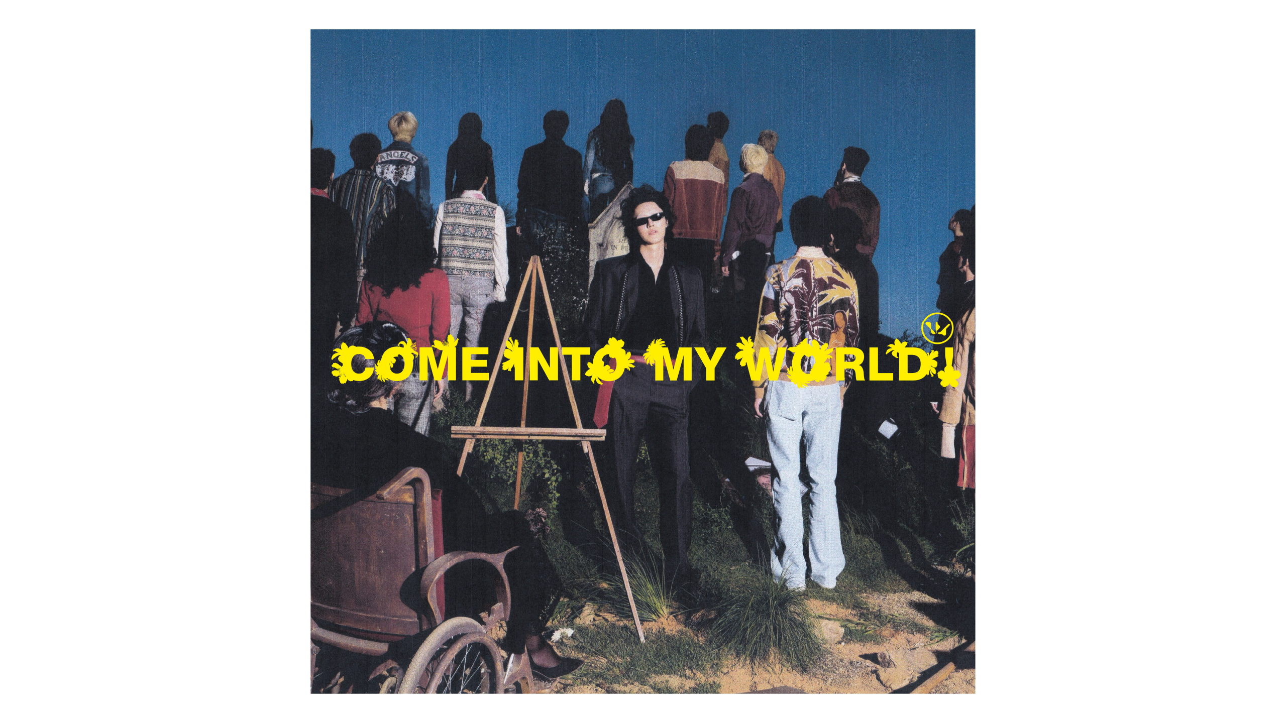
WOODZ의 새로운 싱글 ‘Come into my world!’의 커버 타이포그래피 디자인을 진행했다.
뮤직비디오에서 유쾌하게 표현된 죽음의 이미지와 컬러풀한 커버 아트워크를 꽃의 형태로 은유했다.
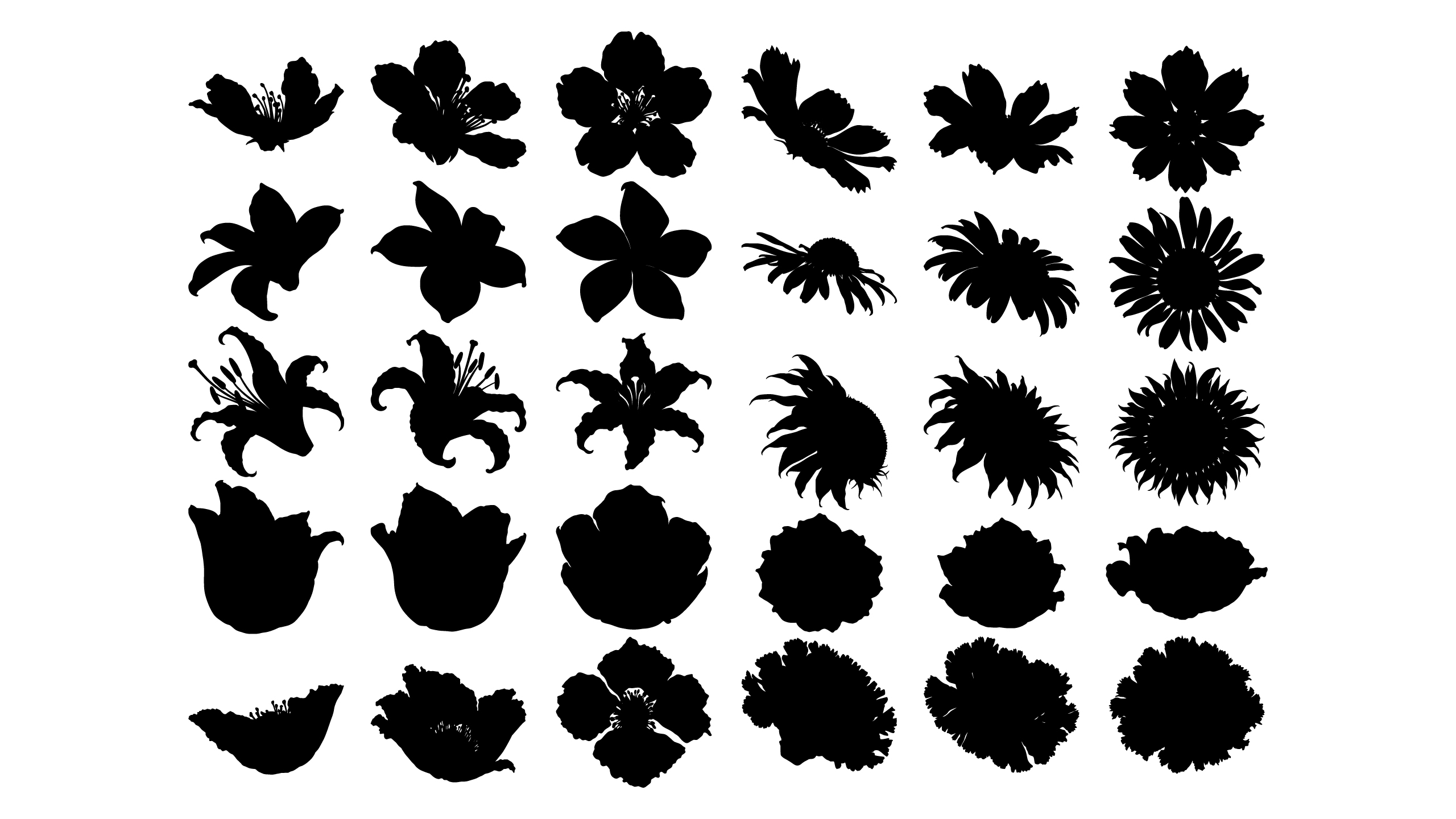
굵고 간결한 산세리프 서체를 기반으로 다양한 꽃의 실루엣을 글자의 획과 곡선에 결합했다. 꽃의 종류와 개화 형태에 따라 달라지는 윤곽을 활용해 글자의 일부를 확장하거나 변형했으며, 기하학적인 서체의 구조와 유기적인 꽃의 형태가 대비를 이루도록 구성했다. 각 글자에 서로 다른 조형적 변화를 부여하면서도 전체적인 균형과 가독성을 유지해 하나의 일관된 타이포그래피로 완성했다.
생명과 죽음이라는 상반된 개념을 내포한 꽃의 상징성을 바탕으로, 곡이 지닌 유쾌하면서도 기묘한 분위기를 시각적으로 전달하고자 했다.
HAUS ARDORYOUTH developed the cover typography for WOODZ’s new single, ‘Come into my world!’
Drawing inspiration from the playful portrayal of death in the music video and the colourful cover artwork, these elements were translated into a visual metaphor through floral forms.
Using a bold, minimal sans-serif typeface as the foundation, various floral silhouettes were integrated into the strokes and curves of the letterforms. The characters were extended and modified according to the distinctive contours of different flowers and their stages of bloom, creating a contrast between the geometric structure of the typeface and the organic forms of the flowers. Each letter was given its own sculptural variation while maintaining overall balance and legibility, resulting in a cohesive typographic composition.
Through the symbolism of flowers, which embody the contrasting concepts of life and death, the typography visually conveys the playful yet uncanny atmosphere of the song.
Lee Raedong
Noh Hyerim
Lee Raedong