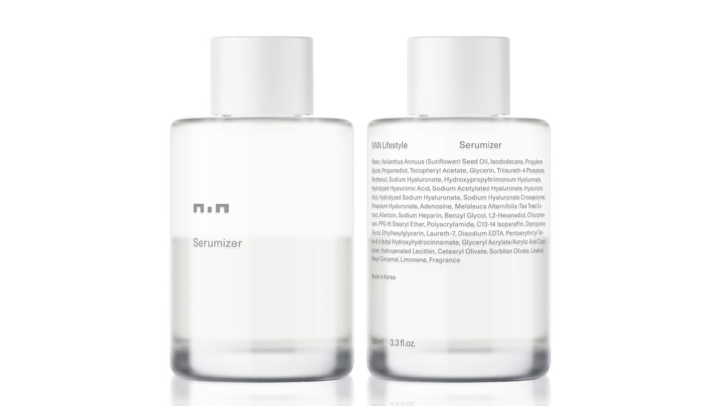
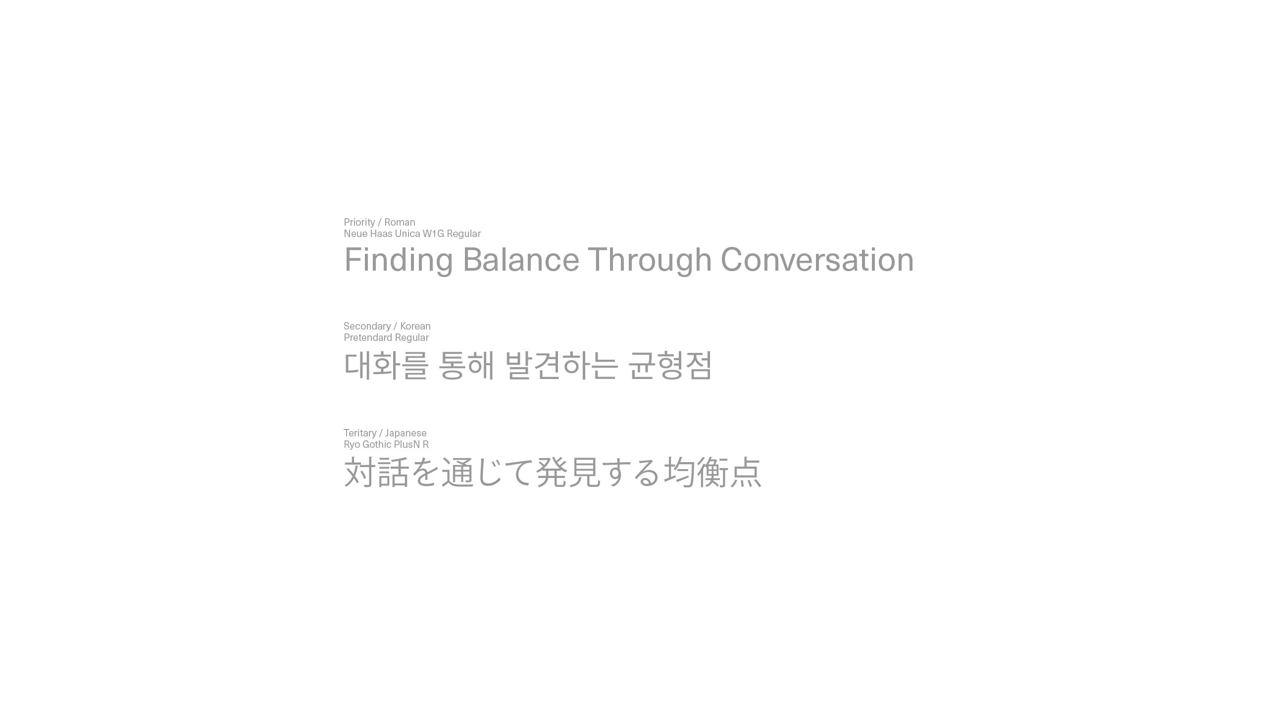
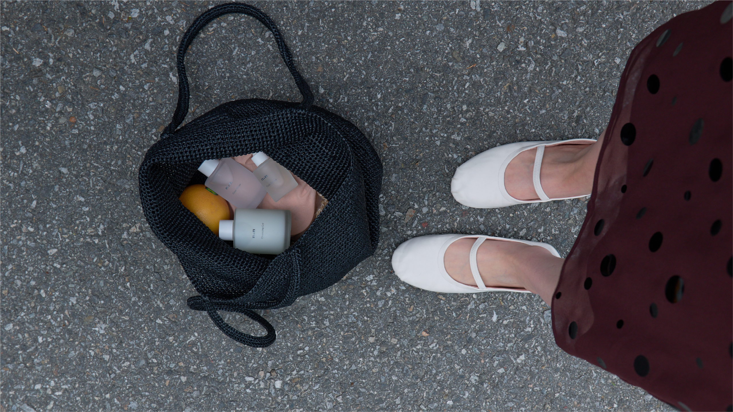
‘경우의 수’에서 출발한 스킨케어 브랜드 NNN은 일본에 기반을 두고 고객과의 대화를 통해 각기 다른 피부 상태에 대해 함께 좋은 방향을 찾아가는 방식을 취한다.
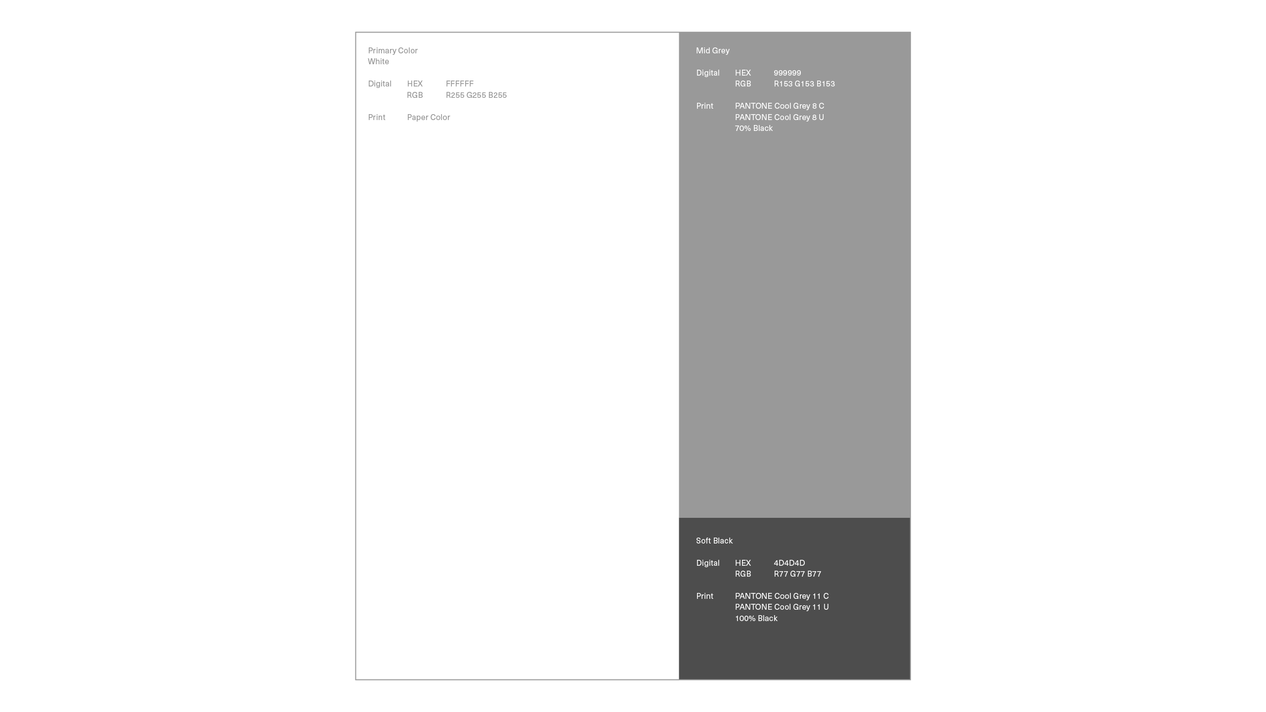
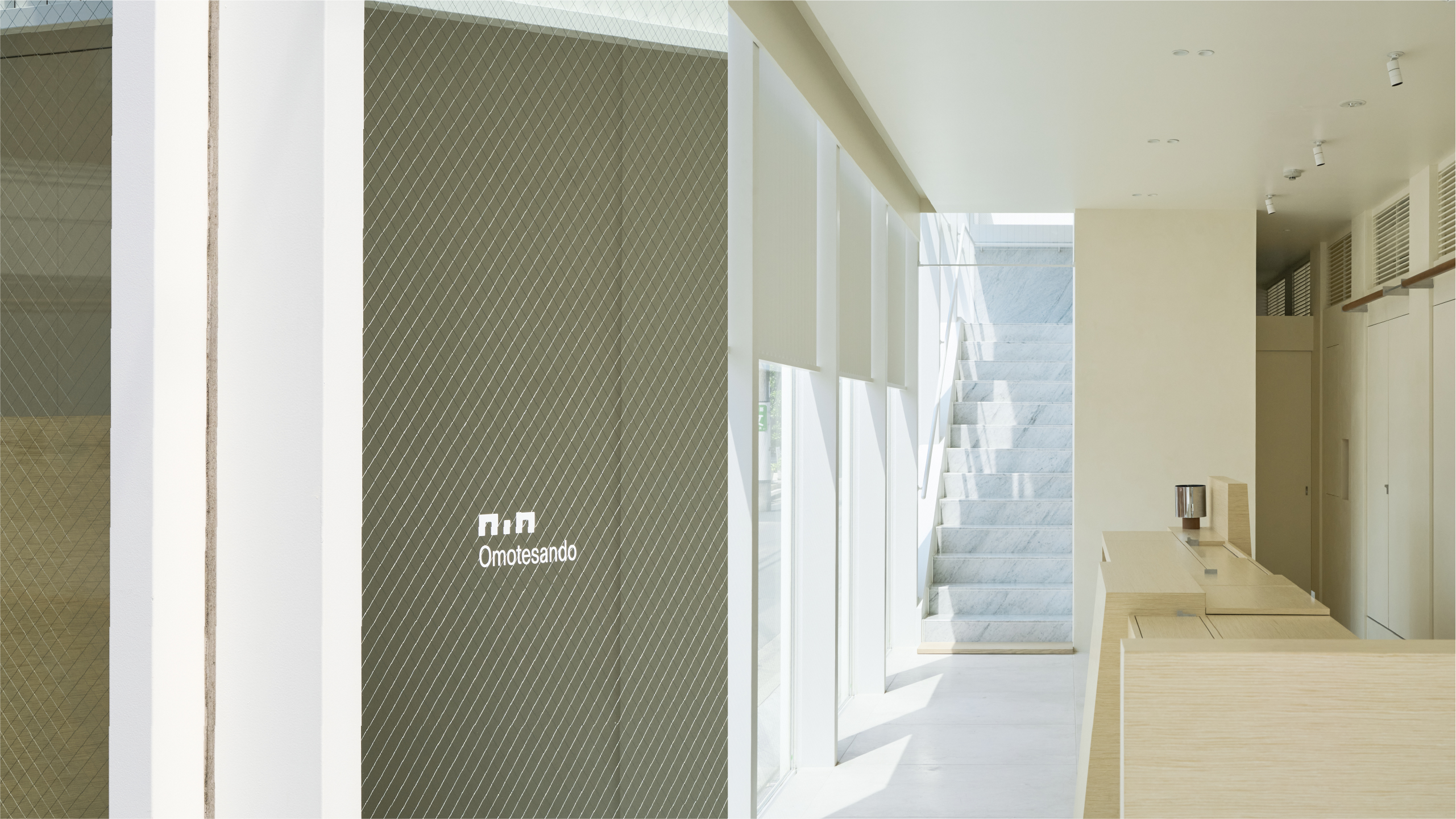
그 태도를 가장 중심에 두고, 무언가를 설명하거나 정리된 답을 보여주는 대신 대화와 스킨케어 자체에 집중할 수 있도록 시각적인 요소를 최대한 줄여 나가는 방식을 택했다.
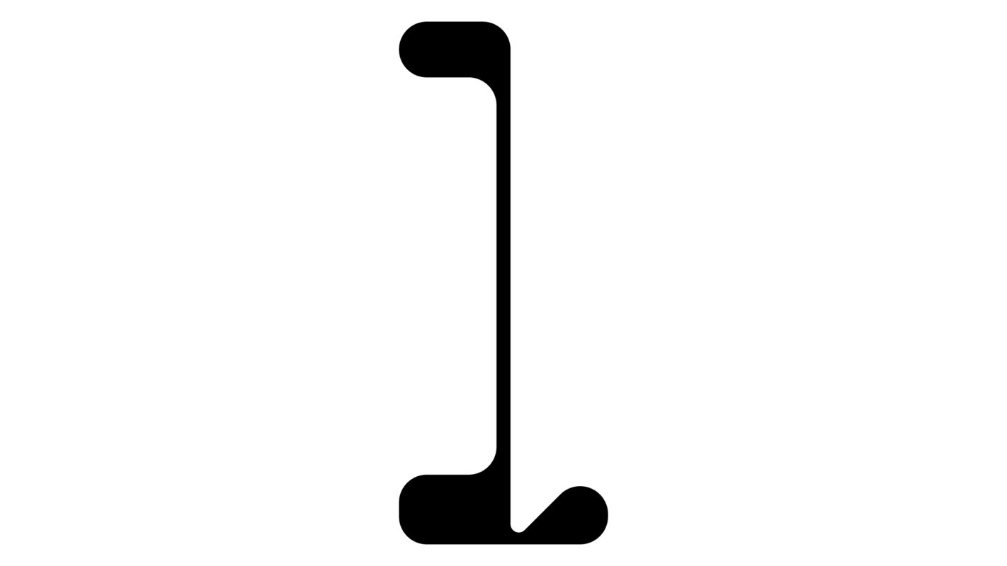
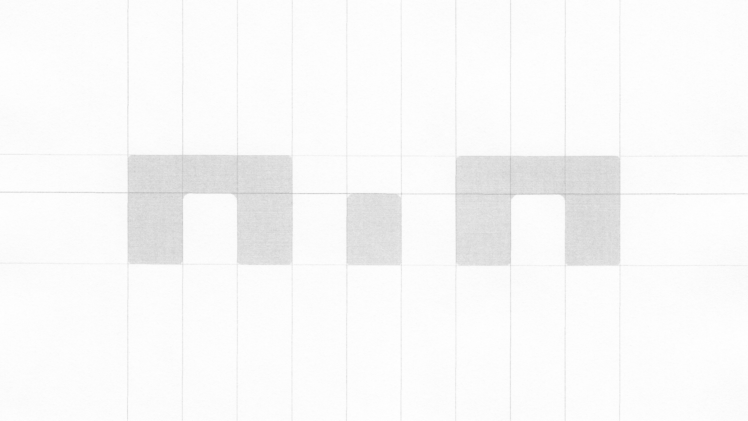
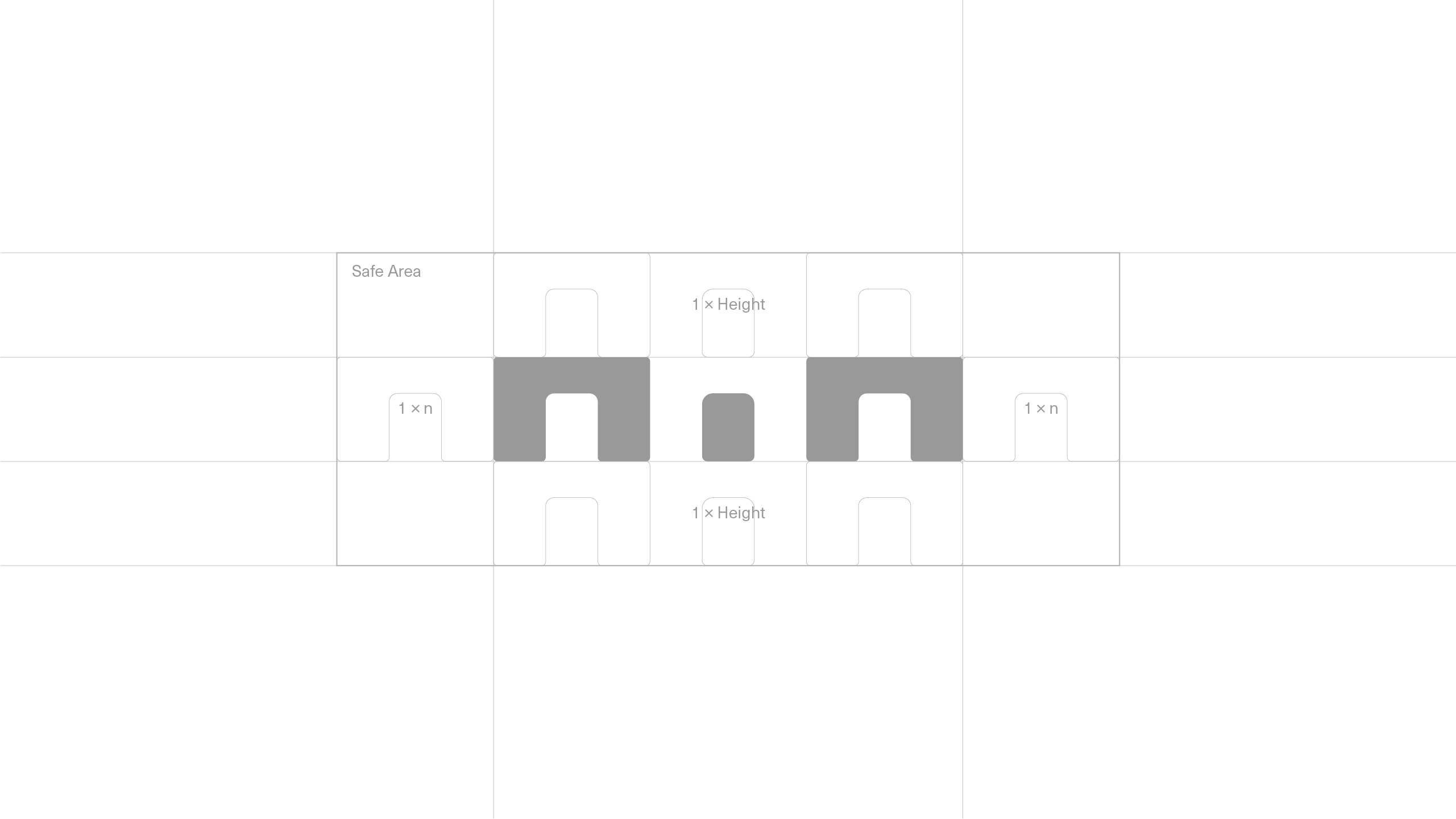
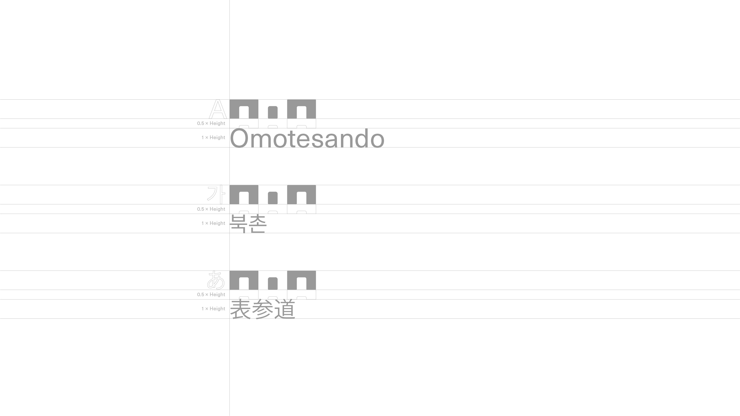
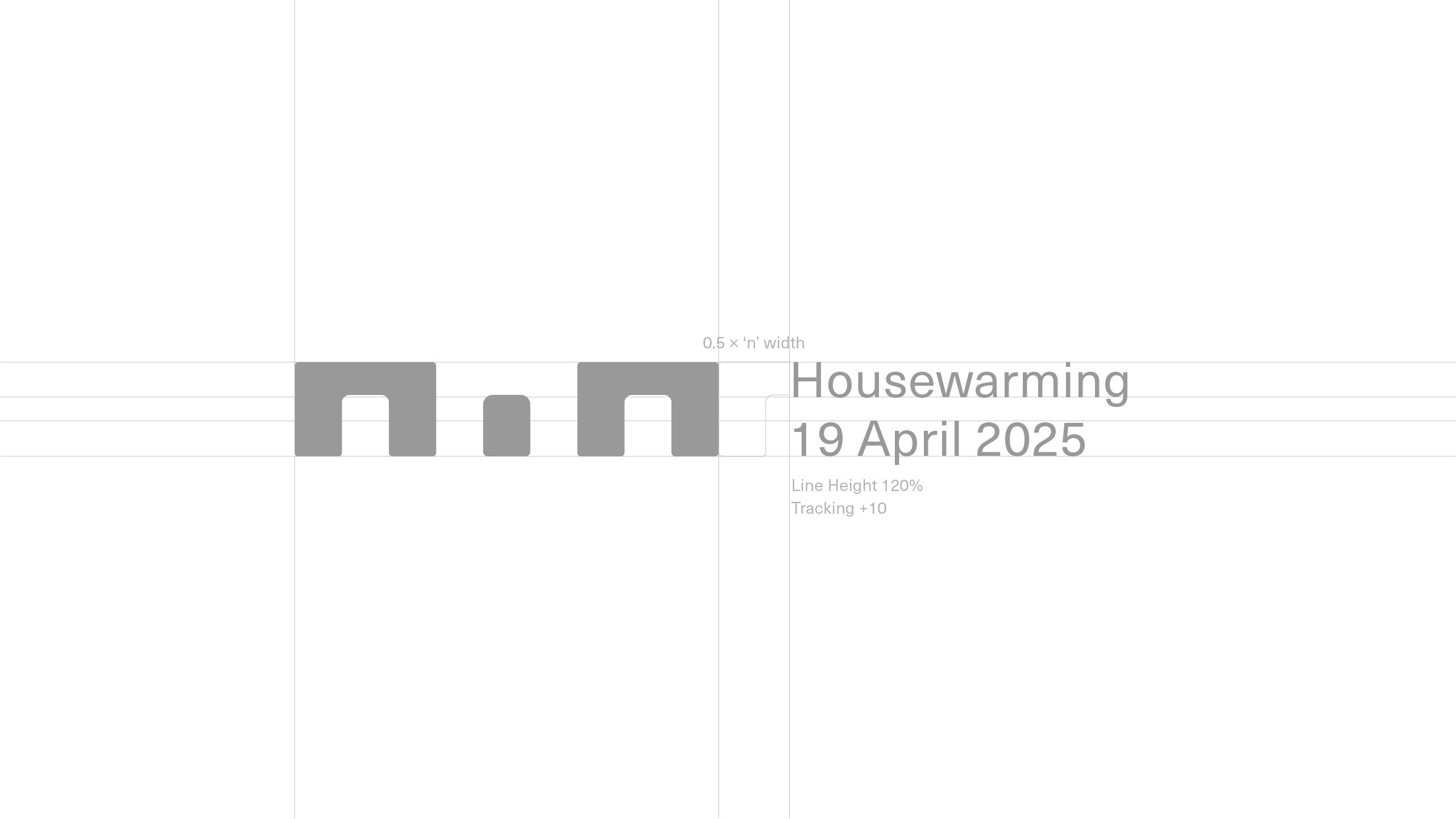
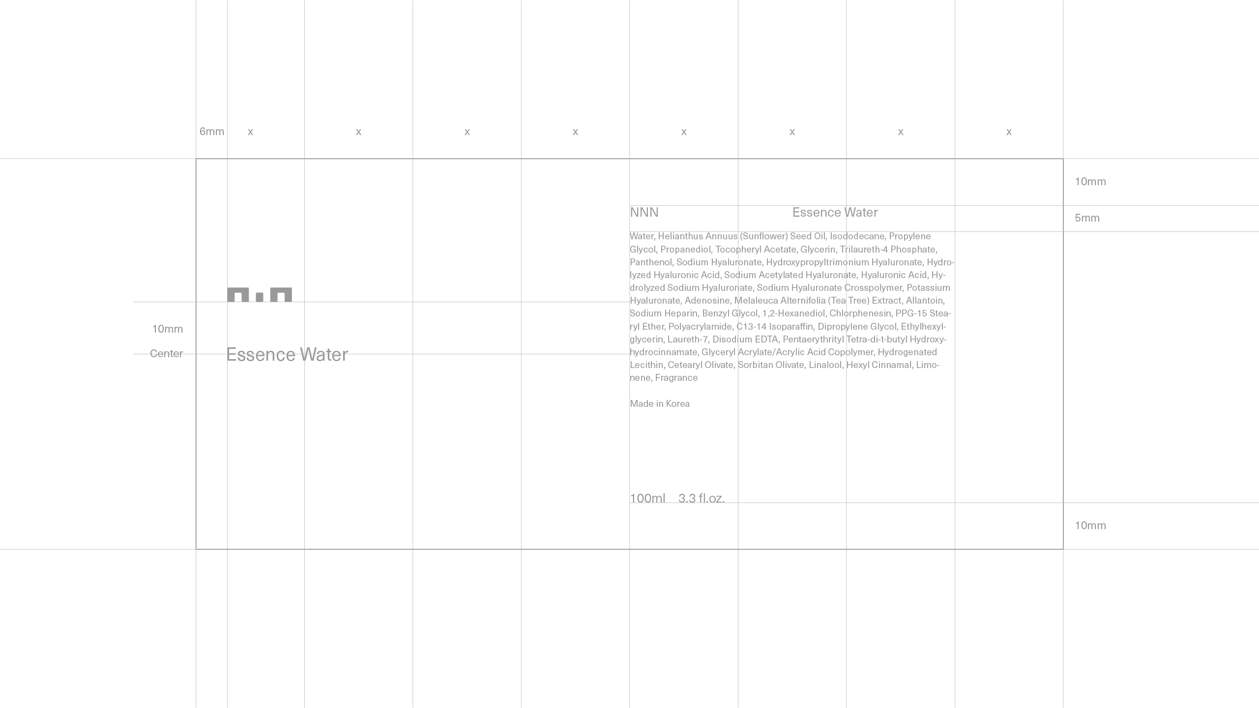
로고타입은 테이블 앞에 마주 앉아 대화를 나누는 두 사람의 형태를 연상시키며, 타이포그래피 역시 조용하고 단정한 구성으로 편안한 인상을 남기도록 설계했다. 이를 통해 단순하지만 쉽게 지나치지 않는 구조, 오래 함께할 수 있는 균형을 고민했다.
NNN is a Japan-based skincare brand whose name originates from the idea of “multiple possibilities.” The brand focuses on engaging in conversation with each customer to explore better directions for their unique skin conditions.
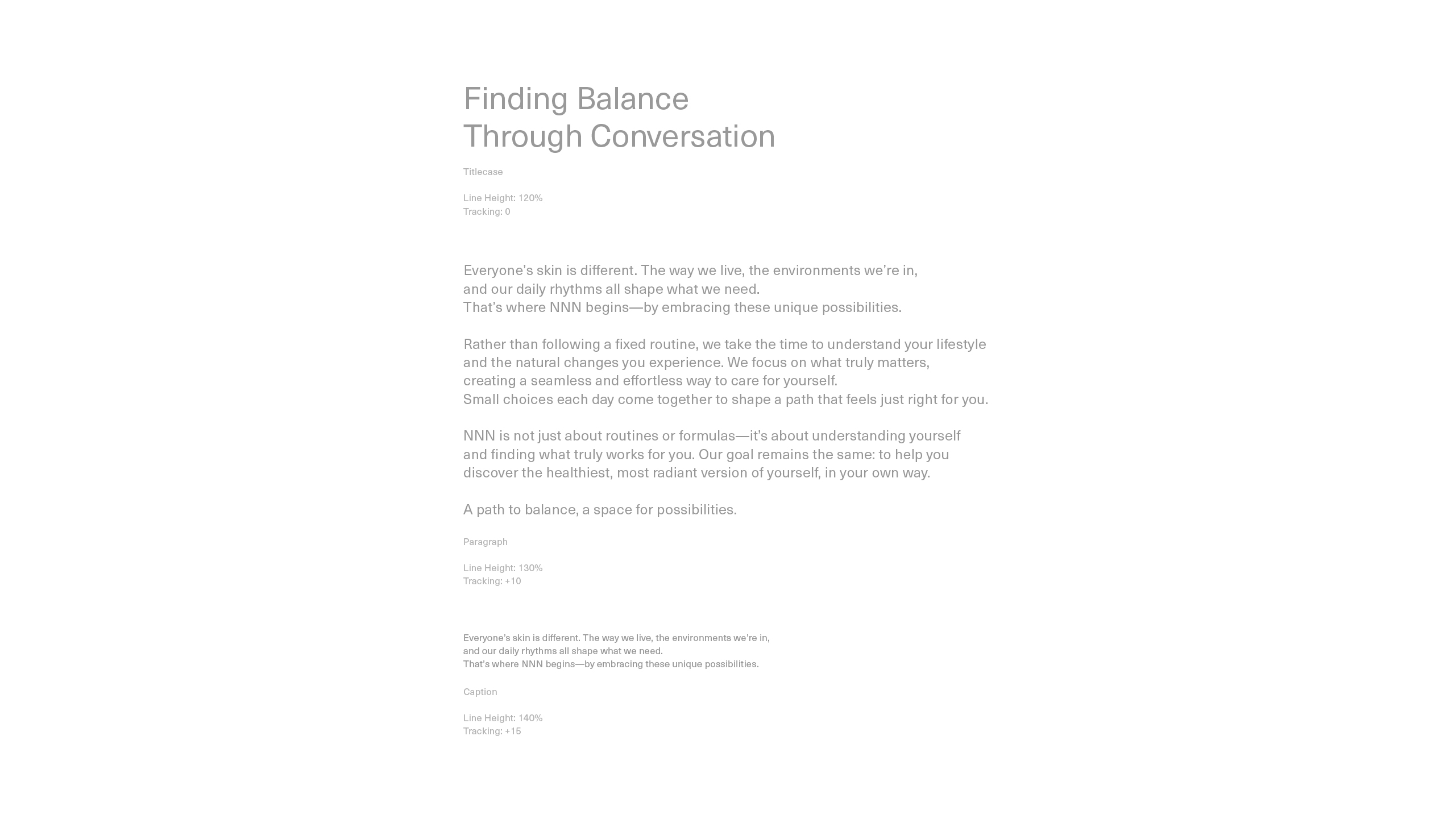
With that attitude at the core, we avoided offering fixed explanations or neatly packaged answers. Instead, we chose to minimise visual elements, allowing room for the act of conversation and skincare itself to take focus.
The logotype evokes two people seated across a table in dialogue. The typography was designed to feel calm and composed, leaving a quiet and approachable impression. Through this, we aimed to build a structure that is simple yet not easily overlooked—a visual balance meant to endure.
NNNは「無数の可能性」という考えから名付けられた、日本を拠点とするスキンケアブランドです。ブランドは、一人ひとり異なる肌の状態に対して、対話を通じてより良い方向を一緒に探っていくことを大切にしています。
その姿勢を軸に、明確な説明や整理された答えを提示するのではなく、対話とスキンケアそのものに集中できるよう、視覚的な要素を極力そぎ落とす方向を選びました。
ロゴタイプは、テーブルを挟んで向かい合い、会話を交わす二人の姿を想起させます。書体は静かで整った構成とし、穏やかで親しみやすい印象を持たせるように設計しました。
シンプルでありながらも見過ごされにくい構造、長く寄り添えるようなバランスを意識しています。
Lee Raedong
Noh Hyerim
Lee Raedong
Noh Hyerim