
WOODZ Album Identity & Packaging Design for WOODZ by HAUS ARDORYOUTH
2026
본 앨범은 아티스트가 좋아하고 가장 잘할 수 있는 요소들을 한데 모아 기록한 첫 번째 아카이빙으로, 그의 음악적 정체성과 취향을 집약적으로 담아낸다.
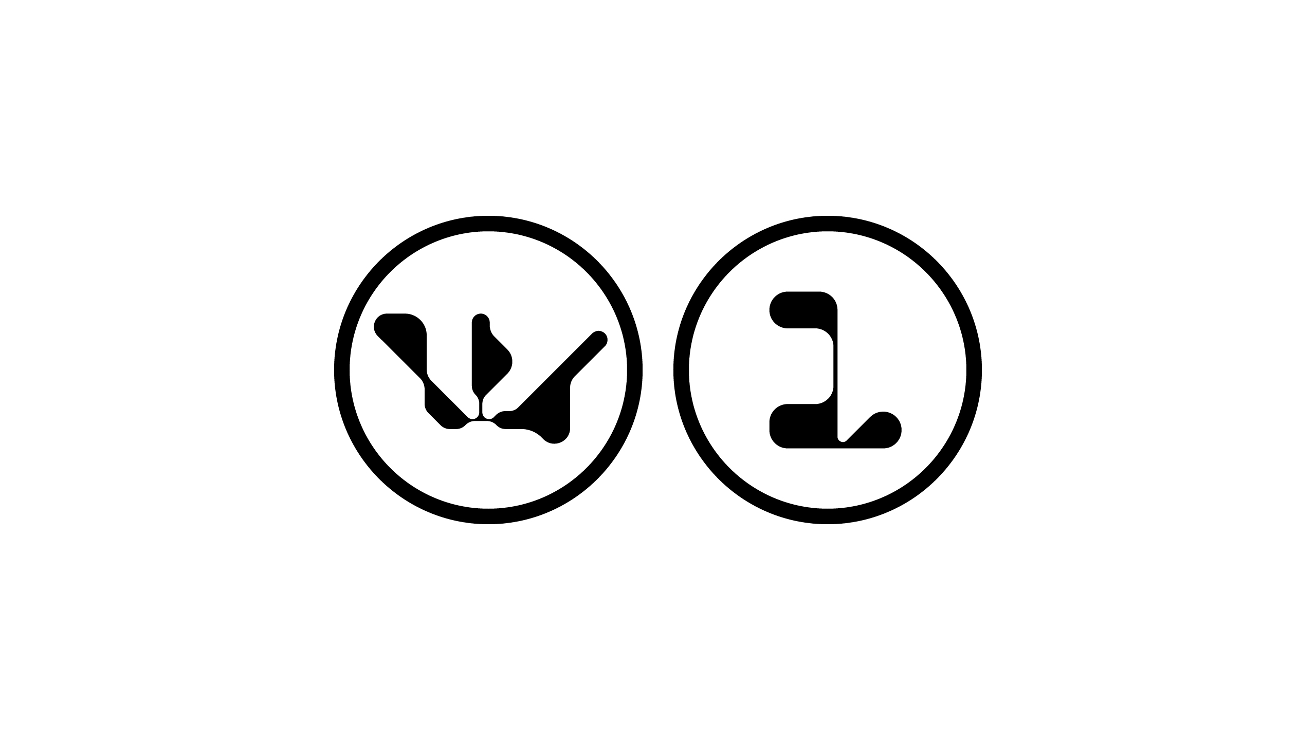
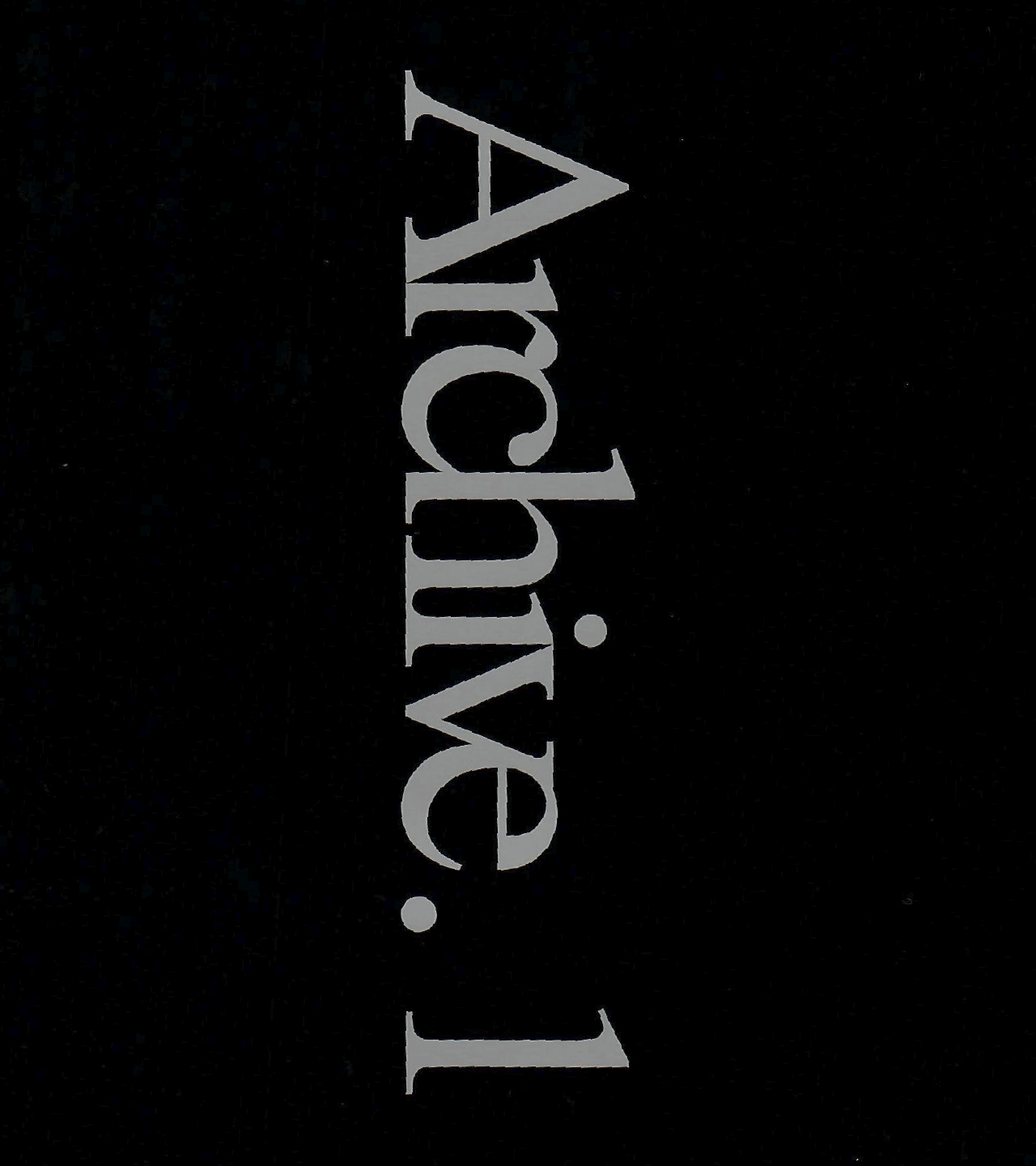
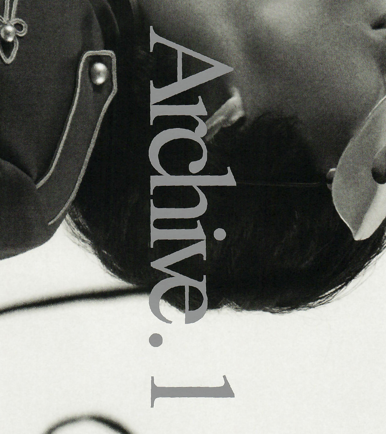
아이덴티티 디자인은 아티스트 로고와 조화를 이루는 기하학적 심볼을 개발하고, 볼드하면서도 무게감 있는 타이포그래피를 적용해 아카이빙된 기록물로서의 인상을 강화했다. 또한 강렬한 레드와 실버의 대비를 중심으로, 긴장감 있는 조합을 통해 아티스트가 축적해 온 에너지와 기록의 밀도를 직관적으로 드러낸다.
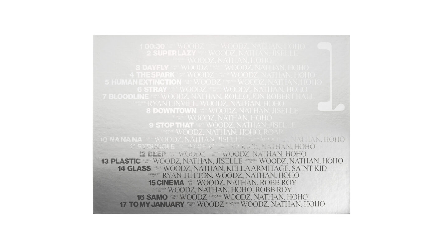
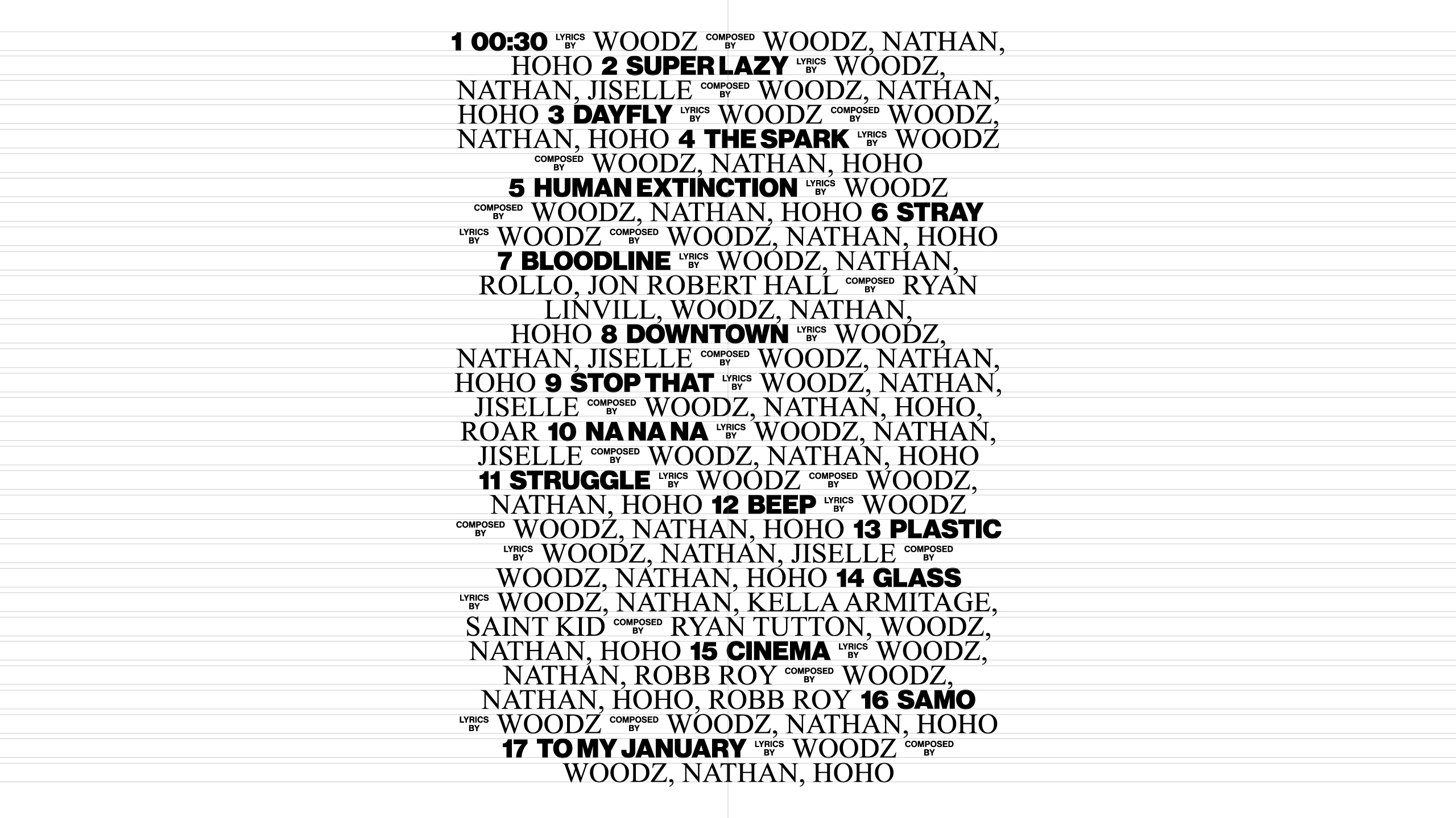
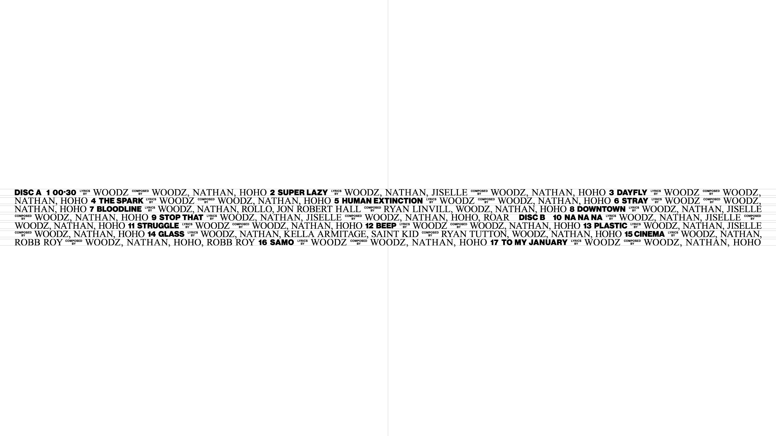
타이포그래피는 볼드하고 무게감 있는 형태로 구성했다. 특히 앨범 박스 전면에는 트랙리스트를 중심으로 한 레이아웃을 적용해 ’기록’이라는 개념을 직접적으로 드러내며, 아카이브의 성격을 강조했다.
This album brings together the elements the artist both favors and excels in, serving as his first archive that encapsulates his musical identity and sensibility.
The identity design begins with the development of a geometric symbol that harmonizes with the artist’s logo. Bold yet weighty typography is applied to reinforce the impression of an archived record. In addition, the contrasting use of intense red and silver creates a sense of tension, visually conveying the accumulated energy and density of the artist’s work.
The typography is constructed with a bold and grounded presence. On the front of the album box, a layout centered around the tracklist is applied, directly expressing the notion of “record” while emphasizing the archival nature of the album.
Noh Hyerim, Lee Raedong
Lee Raedong, Jo Sangmin