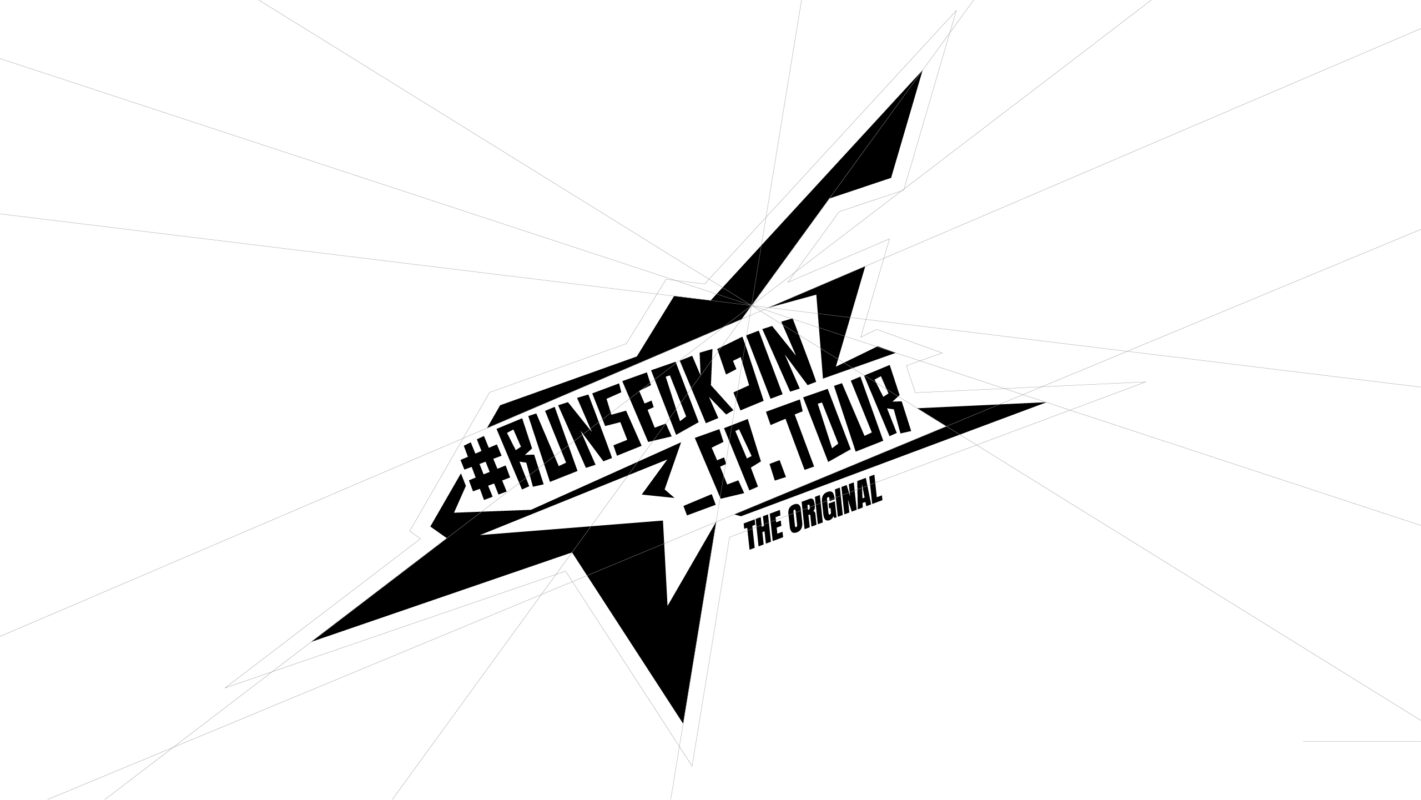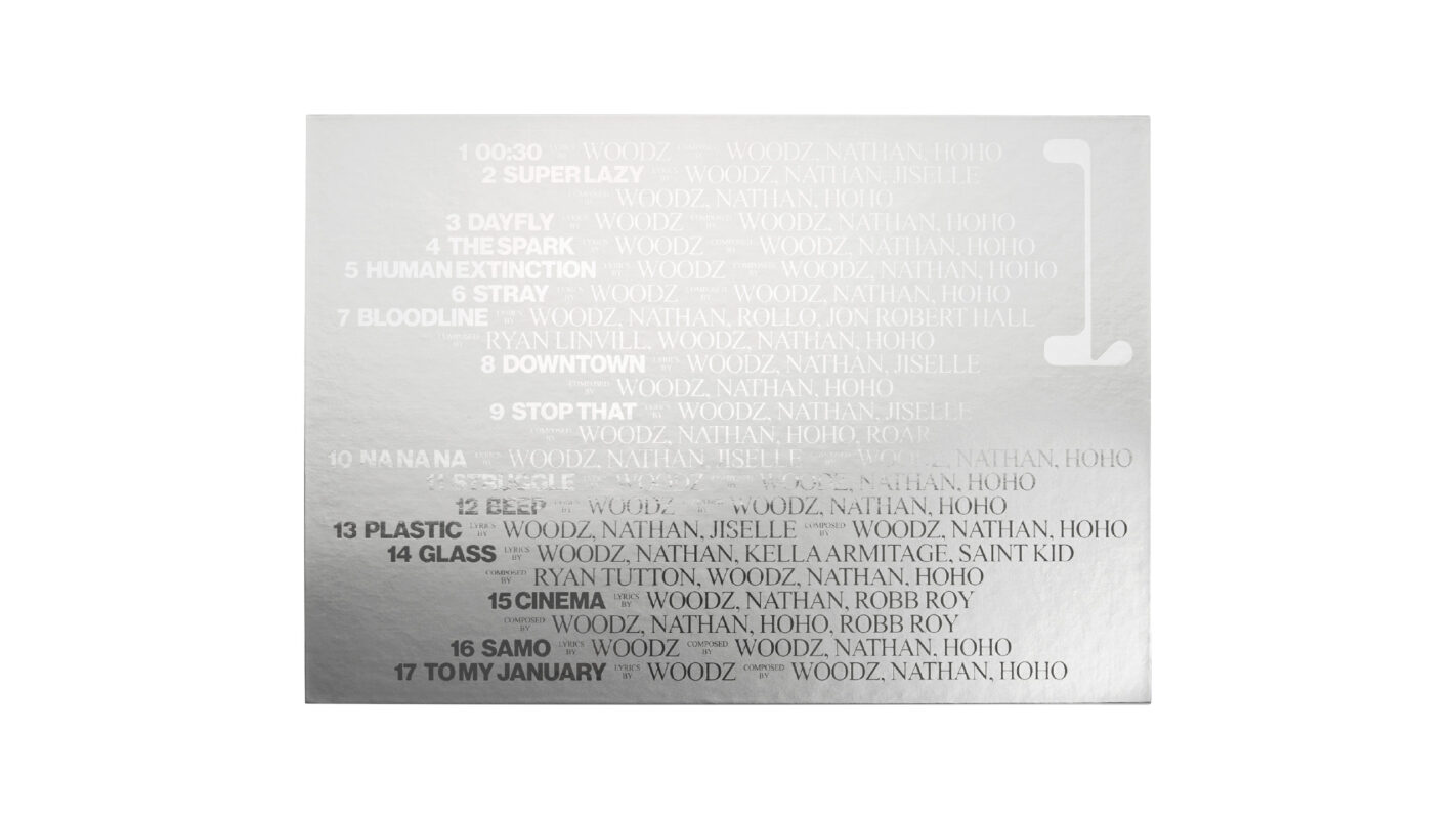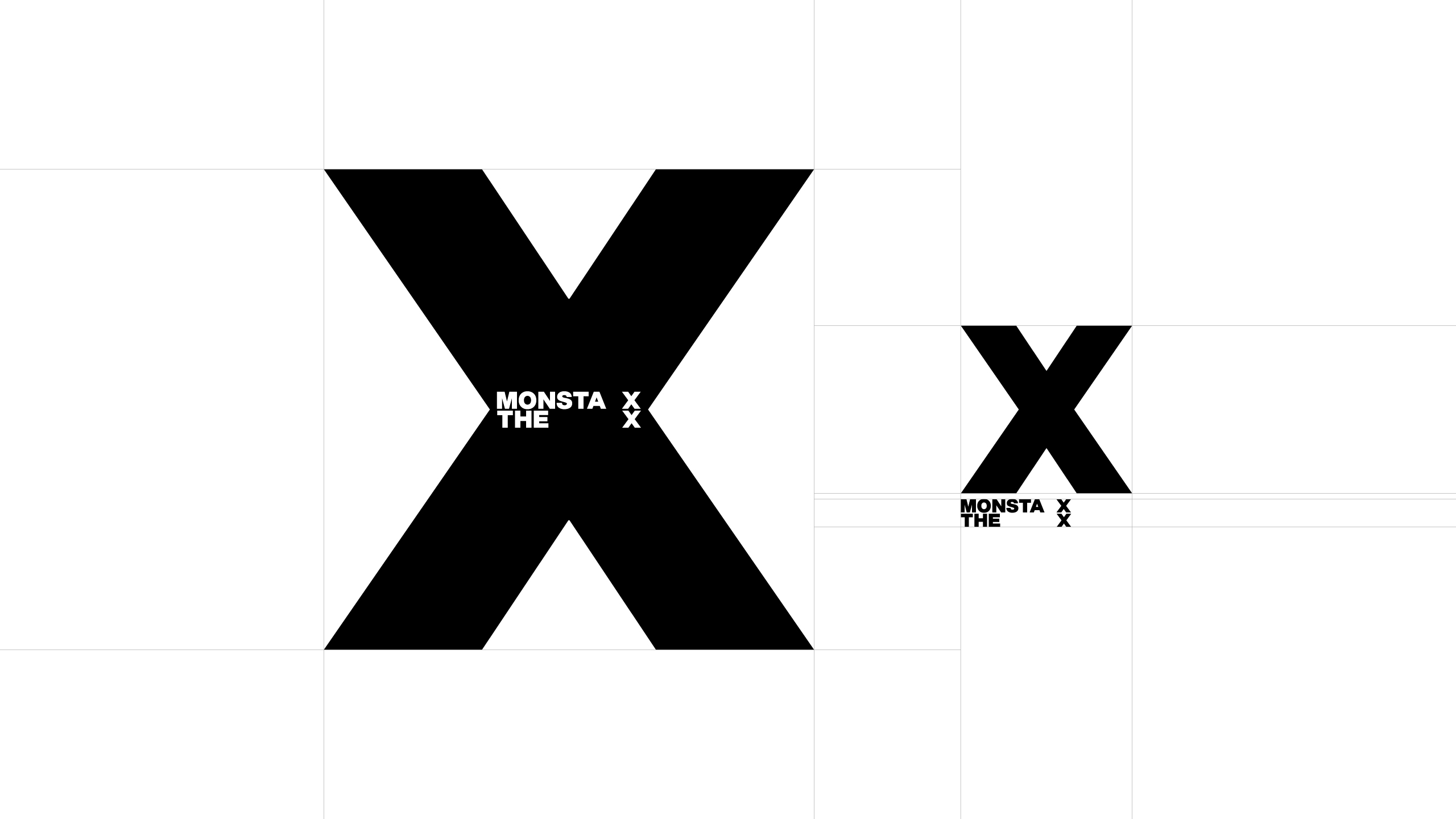
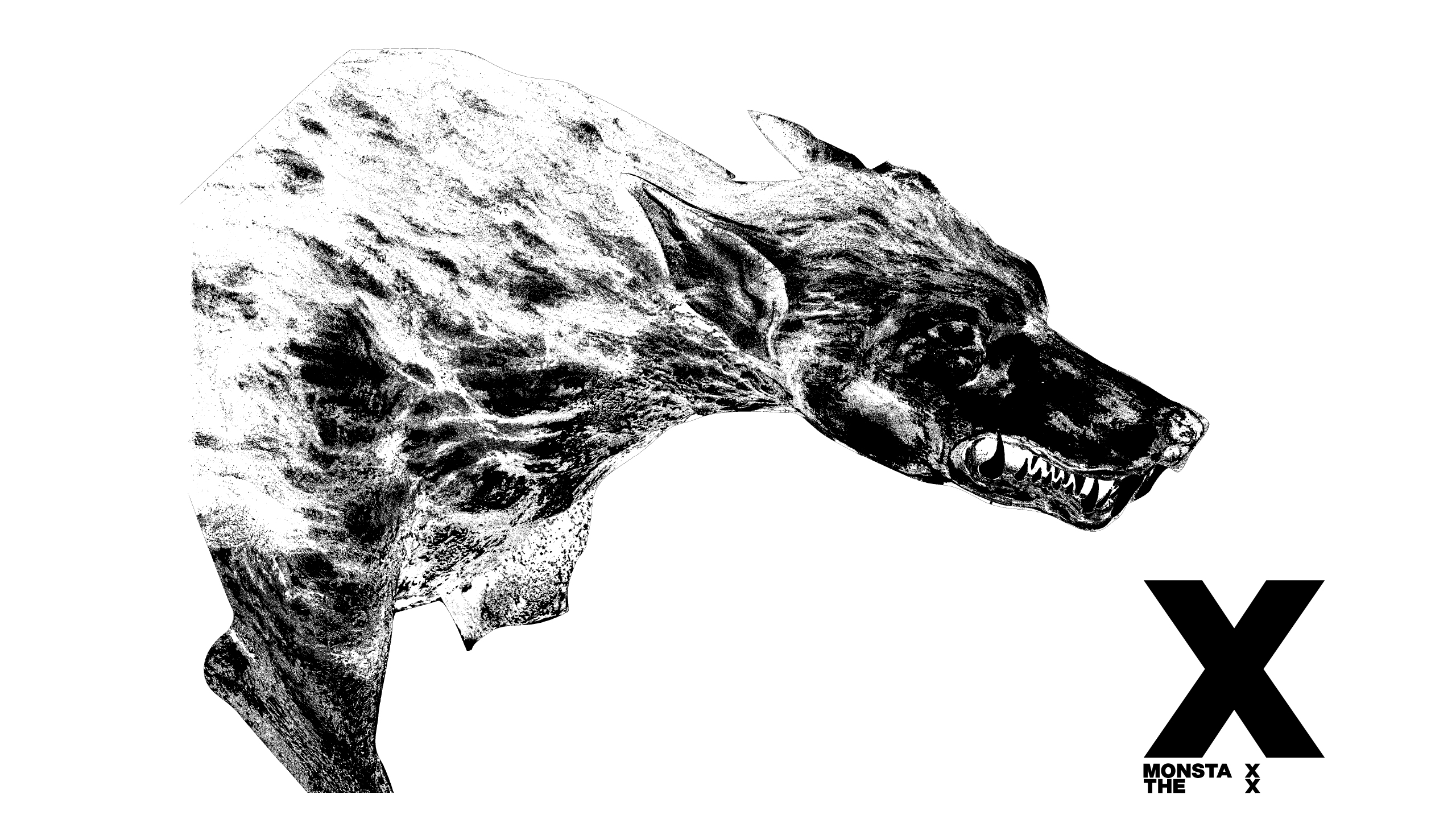
하우스 어덜유스에서 몬스타엑스의 13번째 미니 앨범 『THE X』의 피지컬 앨범과 시각 아이덴티티 디자인을 제작했다. 그룹의 정체성과 10주년을 기념하는 상징으로서의 ‘X’를 중심으로, ‘X’는 몬스타엑스의 이름 속에 담긴 고유한 표식이자, 10년이라는 시간을 상징하는 로마 숫자, 그리고 앞으로 나아갈 미지의 영역을 의미하는 미지수로서 다층적인 함의를 지닌다. 이에 따라 디자인은 ‘X’를 직관적으로 강조하는 대담한 시각 언어로 구축되었다.
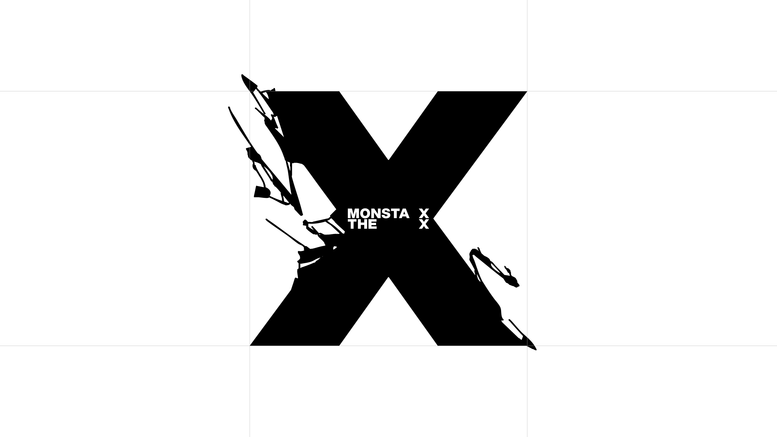
강렬한 타이포그래피 해석을 통해 몬스타엑스가 가진 파워풀한 에너지와 10년간의 성숙한 내공을 동시에 담아내고자 했다. 직선과 교차, 응축된 형태 속에서 ‘X’가 가진 힘을 전면에 드러내며, 동시에 몬스타엑스가 걸어온 궤적과 앞으로 향할 여정을 상징적으로 표현했다.
HAUS ARDORYOUTH developed the physical album and visual identity design for MONSTA X’s 13th mini album, THE X. Placing the symbol ‘X’ at the center, the design encapsulates the group’s identity while commemorating their 10th anniversary. The ‘X’ functions as a distinctive mark within the name MONSTA X, signifies the Roman numeral for ten, and represents the unknown variable that points toward new, uncharted territories—imbuing the symbol with layered meanings.
Accordingly, the design adopts a bold visual language that highlights ‘X’ in its most direct and striking form. Through powerful typographic interpretation, it conveys both the group’s raw energy and the maturity built over a decade. The intersecting lines and condensed structures foreground the strength inherent in ‘X’, while symbolically reflecting MONSTA X’s past trajectory and their journey toward the future.
Noh Hyerim
Lee Raedong
Lee Raedong